A yearbook theme is the single unifying idea, the words, colors, fonts, and photo style, that carries through every page of the book and ties an entire school year into one story. The best themes for 2026 are specific to your school and your year, not recycled phrases like “Making Memories” that could belong to any school in any decade. Below are 50 modern themes, organized into five categories.
Last updated: May 2026
Most theme lists online are either giant flat name-dumps with no guidance or short articles with 14 ideas and no real depth. This one is built differently: 50 named themes across five categories, each with a concept, a cover treatment, the photo style it needs, and a font and color direction. There is also a list of the clichés to retire and the 2026 design trends worth stealing. Use the test that yearbook advisers swear by: if the theme would work for any school in any year, it is a 2014 theme. Skip it.
Building this year’s book? Capturely delivers consistent, student portraits families can capture at home, exported straight to your yearbook platform within 24 hours. See how it works →
What Is a Yearbook Theme?
A yearbook theme is a coordinated system of a central idea plus its visual and verbal expression, the cover concept, color palette, typography, section dividers, captions, and photo treatment, applied consistently from the first page to the index. Advisers call this the “theme package.” A theme is not just a cover slogan. It is the editorial spine that makes 200 pages feel like one publication instead of a scrapbook of unrelated layouts.
According to Katie Moreno, founder of Organized Adviser and a veteran yearbook adviser, the whole point of adopting a theme is that “you’re making a publication, you’re not just making a scrapbook” (Organized Adviser, 2025). National judging frameworks back this up: the Journalism Education Association awards guidelines reward themes built with “visual unifiers and/or wordplay or verbal spinoffs” that fit the school population for the current year (JEA, 2026), the National Scholastic Press Association Pacemaker judges look for strong visual and verbal storytelling working together (NSPA, 2025), and the Columbia Scholastic Press Association scores “concept” as a formal category, defining it as “a unifying idea, rather than a catch phrase theme, which holds a yearbook together” (CSPA, 2025).
A strong theme does three jobs. It gives your staff a decision filter (does this layout fit the theme?), it gives readers a reason to keep the book, and it makes the photography cohere. That last one matters more than most staffs realize, which is why the photo section below is the part nobody talks about. The company that shoots your portraits shapes how well any theme holds together.
Which Yearbook Themes Should You Retire in 2026?
Retire any theme that could describe any school in any year. The most overused offenders are vague, motivational, and instantly dated. Here are 15 to leave in 2014. If your draft title is on this list, push for something specific to your community instead.
- A Year to Remember – the single most-flagged cliché; some staffs informally ban it.
- Making Memories – the shallowest possible read of what a yearbook is.
- Together We Rise – grandiose and completely generic.
- United As One – forced unity with no specific meaning.
- Through the Years – says nothing about this year.
- All In This Together – tired post-pandemic positivity.
- Unforgettable – an unverifiable claim with zero school specificity.
- Seize the Moment – inspirational without saying anything.
- What a Ride – the lazy approach to theming.
- Without Limits – corporate-speak that wandered into yearbooks.
- We Are [Year] / Turn Into [Year] – states the obvious and dates the book.
- That’s a Wrap – reduces the year to a production exercise.
- On the Move – a generic motion metaphor.
- Stand Out – an overused individualism trope.
- Reach for the Stars – motivational-poster tier.
What Are the Biggest Yearbook Theme Trends for 2026?
The 2026 design conversation splits into two opposing camps and a handful of named formats schools are already using. Walsworth’s 2026 trend guidance names eight directions; the strongest signal is the tension between bold minimalism and full maximalism (Walsworth, 2026).
| Trend | What it looks like | Best fit |
|---|---|---|
| Bold Minimalism | Huge strategic type, heavy white space, one or two dominant colors | High school, clean editorial books |
| Maximalism | Saturated color, heavy layering, multiple typefaces, rich texture | Spirited, high-energy schools |
| Altered Type | Letters distorted into design elements while staying readable | Design-forward staffs |
| Bold Color & Jewel Tones | High saturation, luxury jewel tones, metallic “future dust” | Both levels |
| Depth & Collage | Layered text and photos in scrapbook arrangements | Scrapbook-leaning books |
| Natural / Organic | Earthy palettes, authentic natural-light photos, serif and script fonts | Calmer, mature books |
| Retro Futurism | Vintage type reinterpreted with modern polish, chrome, Y2K | Middle school, playful |
| Shapes | Geometric forms, photos clipped inside text, color blocking | Both levels |
On the named-format side, advisers are pushing streaming-style dividers (Bookflix), Spotify-Wrapped data spreads, social-feed layouts (Scroller and FYP), Teen Zine collage, and storybook framing (Chapters, Volume 2026). Color is shifting too: Pantone’s 2026 Color of the Year, a soft white called Cloud Dancer, points toward calmer, type-led books (Pantone, 2026). The meta-trend underneath all of it: authentic, school-specific themes over off-the-shelf phrases. The 50 below are built on exactly that idea.
Identity & Belonging Themes
These themes argue that the school’s identity is built from the individuals in it. Most of them depend on portraits that share the same crop, lighting, and background, so they fall apart fast if photos vary.
1. Composite
Every student becomes one tile in a single massive cover mosaic, so the school’s identity is literally assembled from faces. Make it work: Run a full-bleed grid of identical-format headshots and knock the school name out of the negative space between tiles. This only works with rigorously consistent portraits. Palette & type: Tight modern grotesque, grayscale grid with one school-color accent. Best for large schools, HS and MS.
2. Self-Portrait
A meditation on how teens curate their own image: each spread pairs a clean studio portrait with the student’s handwritten note about who they really are. Make it work: Center one crisp portrait and layer scanned handwriting over it like a labeled diagram. The polished photo has to contrast the messy ink. Palette & type: Neutral serif plus real student handwriting, warm off-white base. Best for HS.
3. The Venn
Belonging shown as overlapping circles, with students placed at the intersections of the clubs and friend groups they share. Make it work: Use translucent overlapping color circles in your palette and drop cutout portraits into the overlaps. Clean backgrounds keep cutouts from looking pasted on. Palette & type: Geometric sans, dopamine brights, translucent gradients. Best for MS.
4. Fragments
Built on the idea that identity is fluid: each student appears as a small collage of cropped details, a portrait, their hands, an object they brought. Make it work: Anchor every collage with one consistently shot lead portrait surrounded by candid detail shots, on torn-paper and scanned textures. Palette & type: Condensed grotesque plus scanned handwriting, riso overprint colors. Best for HS.
5. Roster
Treats the whole school like a credited cast, giving every student equal billing in trading-card framing. Make it work: Crop studio-consistent portraits identically into card frames with a hero card up front. The format collapses if portraits are not uniform. Palette & type: Bold condensed athletic type, foil and chrome accents, team colors. Best for MS and HS.
6. In Our Own Words
A type-forward book where student quotes are the design and portraits are the supporting evidence. Make it work: Let oversized quotation marks dominate spreads and keep portraits quiet and editorial so the typography stays the star. Palette & type: Oversized bold serif, single ink color, generous white space. Best for HS.
7. The Many
A celebration where a diverse student body is the headline, with one-word self-descriptors in many languages and styles. Make it work: Set the title in a dozen typefaces and scripts over a portrait grid. Lighting must render every skin tone fairly, a real strength of directed photography. Palette & type: Multi-script type pairing, warm neutral base, jewel-tone accents. Best for MS and HS.
8. Open Door
Belonging framed through thresholds: every student photographed as if stepping into the school’s open door. Make it work: Frame portraits inside a repeated arch with a soft glow behind. The repetition only works if subject placement and lighting match. Palette & type: Rounded warm serif, soft sunset gradient, cream base. Best for MS.
9. Find Your People
Maps the social ecosystem honestly: clubs, lunch tables, group chats, and teams, each with its own badge. Make it work: Build a patch wall of embroidered-style badges, one portrait per badge, shooting groups and individuals to a shared template. Palette & type: Patch and badge lettering, varsity-meets-scout palette, felt textures. Best for MS and HS.
10. Unfiltered
A direct response to AI-perfect imagery: the book stakes itself on real, human, professionally shot faces. Make it work: Lead with one striking, honest close-up and minimal type. The whole concept rests on photography that reads as authentically human, not generated. Palette & type: Stark modern grotesque, true black on white. Best for HS, strong flagship.
Place & Hometown Themes
These root the year in a specific location. They lean on environmental portraits, so consistent exposure keeps subjects clean against busy real-world backgrounds.
11. Coordinates
Geo-tags the book to the exact place this class existed, turning the school’s latitude and longitude into the hook. Make it work: Set the coordinates as the title over faint topographic lines, with a consistent background system behind portraits. Palette & type: Monospace plus condensed sans, navy and topo green, map textures. Best for HS.
12. Local Legend
Celebrates hometown landmarks, the diner, the water tower, the field, as backdrops to student life. Make it work: Run an illustrated landmark band across the bottom with portraits above, lit consistently so subjects pop against location backgrounds. Palette & type: Vintage tourism-poster type, screen-printed retro palette. Best for MS and HS.
13. Hometown Press
The yearbook styled as the local newspaper of record for one school year, with headlines, datelines, and beats. Make it work: Build a masthead front page with column rules and a duotone treatment applied uniformly across documentary-style coverage. Palette & type: Newspaper serif plus grotesque headlines, newsprint cream, single duotone ink. Best for HS, journalism staffs.
14. The Block
Frames the school as a neighborhood with streets (hallways), districts (departments), and residents. Make it work: Draw a stylized street-map of the grounds with a “you are here” pin on a portrait. Uniform cutouts keep the map legible. Palette & type: Wayfinding and transit signage type, bold primary palette. Best for MS.
15. Weather Report
Organizes the year by the local seasons that shaped it: the snow days, the heat, the storm that canceled the game. Make it work: Use riso-style weather icons over portraits with grain texture, shooting each season to one consistent treatment. Palette & type: Riso overprint (blue plus fluorescent orange), chunky rounded sans. Best for MS and HS.
16. Home Field
Roots identity in physical home turf: the gym floor, the stadium grass, the parking lot becomes the texture. Make it work: Composite portraits over extreme close-ups of field and court textures, with uniform lighting so the backgrounds carry the mood. Palette & type: Athletic condensed type, school colors, turf and hardwood textures. Best for MS and HS.
17. Postcard From
A travel-postcard love letter to the town, where each section is a postcard mailed from a local spot. Make it work: Set big retro “Greetings From” lettering with portraits inside the letterforms, styled like vacation snaps but professionally lit. Palette & type: Mid-century travel-poster lettering, saturated retro palette. Best for MS.
18. The Commute
Tells the year through how everyone gets here: the bus, the bike, the long drive, the walk. Make it work: Lead the eye down a motion-blur path to a sharp portrait at the destination. Subject sharpness must be uniform to sell the arrival. Palette & type: Transit and kinetic type, asphalt grays plus signal yellow. Best for HS.
19. Backyard
A comfort-culture framing of the immediate world: the backyard, the cul-de-sac, the corner store. Make it work: Use warm film-grain portraits in natural settings with hand-drawn doodle accents, exposed consistently across the book. Palette & type: Friendly rounded serif plus marker doodles, sun-faded palette. Best for MS.
20. Built Different
An architectural homage to the building itself: the specific bricks, lockers, and stairwells of this school. Make it work: Drop clean, structured portraits into a bold architectural grid. Consistency reinforces the built-environment rigor. Palette & type: Brutalist rounded type, concrete gray plus one warm accent. Best for HS.
Time & Memory Themes
These treat the year as something to archive. Comparison and timeline formats only stay honest when portrait setups are deliberately matched.
21. Timestamp
Logs every photo and quote with a precise time, so the book reads like a continuous archive instead of a highlight reel. Make it work: Run a vertical timestamp column down the side with faint metadata text. Uniform portraits make the archive feel credible. Palette & type: Monospace metadata plus clean sans, terminal black on white. Best for HS.
22. Long Exposure
A photography metaphor: the whole year captured as one long exposure of light and motion. Make it work: Hold a crisp portrait still at the center of a light-trail image. The portrait sharpness is the anchor. Palette & type: Elegant thin serif, deep midnight blue, neon light trails. Best for HS.
23. Analog
Leans into the film-camera revival: the year shot like a roll of 35mm with grain, light leaks, and frame numbers. Make it work: Add a filmstrip border with sprocket holes and a frame counter, applying warm film grain as one uniform treatment. Palette & type: Film-canister stencil type, Kodak-warm palette, grain texture. Best for MS and HS.
24. Dear Diary
Built like the junk-journal trend: taped tickets, receipts, doodles, and Polaroids layered into a tactile time capsule. Make it work: Center Polaroid-framed portraits in the collage chaos. Consistent portrait quality keeps it charming, not sloppy. Palette & type: Handwriting plus typewriter, washi-tape pastels, paper textures. Best for MS.
25. Rewind
Plays the year backward, opening at the last day and rewinding to the first, a fresh twist on chronology. Make it work: Use a VHS rewind motif and scrubber bar with a lightly glitched portrait. Uniform application keeps the glitch tasteful. Palette & type: VHS on-screen type, CRT blue plus scanline texture. Best for HS.
26. The Archive
Treats the year as a museum collection, giving every artifact and its owner a catalog number. Make it work: Use museum-label minimalism, one specimen photo, and generous white space, with quiet evenly lit catalog-style portraits. Palette & type: Refined serif plus small-caps labels, gallery white, one ink. Best for HS, very mature.
27. Golden Hour
Frames the year as one long golden hour, the warm light of being young right now. Make it work: Use warm natural-light-look portraits with a soft gradient sky. Color grading must match across the book to sustain one mood. Palette & type: Soft serif, amber-to-peach gradient, cream. Best for MS and HS.
28. Mixtape
Organizes memory as a tracklist, where each section is a track and student quotes are liner notes. Make it work: Build a cassette or album-cover layout with a hero portrait as the album art. The metaphor demands portraits that look produced. Palette & type: Retro record-label type, riso two-color, tape textures. Best for MS and HS.
29. Same Time Next Year
A then-and-now device: students rephotographed in the same pose and spot as a prior year, making time visible. Make it work: Pair a younger portrait with a current one in matched setups. Lighting and crop continuity are everything for an honest comparison. Palette & type: Clean editorial serif, muted duotone past, full-color present. Best for HS, especially seniors.
30. Field Notes
The year documented like a naturalist’s journal: observations, sketches, and student “specimens” recorded with curiosity. Make it work: Pair consistent, well-composed portraits with hand annotations on a sketchbook cover. Clean photos keep the journal tidy. Palette & type: Naturalist serif plus handwriting, sepia and sage, paper grain. Best for MS.
Pop Culture & Internet Themes
These reference formats and platforms instead of specific shows or songs, which keeps them school-safe, licensing-safe, and slow to date.
31. For You
The year laid out like a short-form vertical feed, each spread a full post you scroll, without naming any one app. Make it work: Use a vertical-video frame with caption text and a progress bar, cropping portraits vertically to one consistent format. Palette & type: UI-style sans, high-contrast white-on-photo captions, gradient accents. Best for MS and HS.
32. Now Streaming
Frames clubs, teams, and grades as series in a streaming library, each with a poster and an episode count. Make it work: Build a tile grid of portrait-driven show posters with matching dramatic lighting so every series looks like one platform made it. Palette & type: Bold cinematic sans, dark UI background, one neon accent. Best for HS.
33. Group Chat
Tells stories through the rhythm of group-chat threads, with portraits attached to messages. Make it work: Cascade stylized chat bubbles with circular avatar-crop portraits shot consistently so every sender reads clearly at small size. Palette & type: Chat-UI sans, soft bubble palette, neutral background. Best for MS.
34. Patch Notes
Borrows gaming’s update-log language to chronicle how the school leveled up: new features, fixes, achievements. Make it work: Use a game-UI HUD layout with a “v2026” version number and character-select portrait cards. Uniform crops sell the metaphor. Palette & type: Pixel and UI hybrid type, dark-mode palette, XP-bar accents. Best for MS and HS.
35. Trending
Organizes the year by what genuinely trended in the building: the catchphrases, the fits, the moments. Make it work: Layer a maximalist sticker-collage of trending tags over bold portraits. The portrait grid keeps the maximalism from collapsing. Palette & type: Dopamine maximalism, sticker graphics, clashing-on-purpose brights. Best for HS.
36. Aesthetic
Plays on how everything is an “-core” now, letting each section adopt its own micro-aesthetic. Make it work: Unify wildly different section styles with one consistent portrait treatment. The portraits are the only constant, so they must match. Palette & type: Multiple type personalities per section, unified by a single text color. Best for HS, meta and self-aware.
37. Reaction
Built around expression and emotion: the genuine reactions of a year, the win, the surprise, the cringe. Make it work: Grid expressive close-up portraits with big reaction-style type. Even animated faces need uniform exposure and crop. Palette & type: Bold rounded sans with meme energy but clean, bright flat colors. Best for MS, high energy.
38. The Drop
Treats the senior class or new year like a hyped product launch or sneaker drop. Make it work: Use a hype-poster layout with “limited edition 2026” and high-production portraits with matching dramatic lighting. Palette & type: Streetwear condensed caps, chrome plus a bold accent. Best for HS.
39. Receipts
Uses the receipt and ephemera trend to itemize the year, every event and memory printed like a register tape. Make it work: Run a long thermal-receipt graphic of the year’s “purchases” with small portraits stapled on. Uniform crops keep the gag readable. Palette & type: Monospace receipt type, thermal-paper white, red stamp accents. Best for HS.
40. Caption This
Inverts the format by making student-written captions the main event, with portraits as the prompts. Make it work: Pair clean, neutral-expression portraits with a big caption field. Uniformity keeps the prompt framing intact. Palette & type: UI sans plus handwritten captions, neutral base, one highlight color. Best for MS and HS.
Future & Ambition Themes
These point forward. The minimalist, type-led options in this group lean hardest on a single exceptional portrait, so photo quality is the entire design.
41. Loading
Frames the class as a work in progress, mid-render, about to launch into whatever’s next. Make it work: Use a progress bar at “2026% loading” with a portrait resolving into focus. The portrait’s clarity sells the payoff. Palette & type: Sci-fi grotesque, chrome gradient, electric blue. Best for MS and HS.
42. Class of the Future
A retro-futurist “what we’ll become” book blending Space Age optimism with present-day faces. Make it work: Frame clean, optimistic portraits in retro-tech viewports with mid-century illustration. Palette & type: Atomic-age plus chrome type, cosmic neon over soft pastels. Best for MS.
43. Blueprint
Treats ambitions as architecture: every student drafting the blueprint of who they’re becoming. Make it work: Set precise portraits into a technical-drawing grid with annotations. The schematic look needs portraits aligned uniformly. Palette & type: Technical mono plus condensed sans, blueprint blue and white linework. Best for HS.
44. Open Tabs
Frames each student as a browser full of open tabs: interests, goals, and side quests all running at once. Make it work: Use a browser-window layout with multiple goal tabs and a portrait as the active tab. Uniform crops keep it legible. Palette & type: Clean UI sans, light-mode neutral, an accent per tab. Best for HS.
45. Liftoff
Pure launch energy for a graduating class: countdown, ignition, trajectory. Make it work: Use countdown numerals and a launch-trajectory line with heroic low-angle portraits and matching lighting. Palette & type: NASA-mission mono plus bold sans, deep space navy plus ignition orange. Best for HS seniors and MS promotion.
46. To Be Continued
Frames the year as one chapter in a longer story, ending on a deliberate cliffhanger. Make it work: Use a book-spine motif (“Chapter 2026”) with cinematic editorial portraits under a unified narrative grade. Palette & type: Oversized literary serif, warm cream, single ink. Best for HS, mature.
47. Future Self
Pairs each portrait with a one-line message to the student’s future self, sealing the book as a time capsule. Make it work: Use a “do not open until” wax-seal motif over sincere forward-facing portraits. Uniform treatment makes the promise feel official. Palette & type: Stamped or typewriter type plus clean sans, kraft plus foil accent. Best for MS and HS.
48. Under Construction
Owns the messy middle of growing up, reframing “not finished” as exciting rather than anxious. Make it work: Soften hazard-stripe accents with rounded type and a confident centered portrait. Uniformity keeps the construction playful. Palette & type: Rounded brutalist type, safety yellow plus warm gray. Best for MS.
49. The Forecast
Casts the future as a weather forecast for the class: high chance of greatness, scattered ambition. Make it work: Use a forecast-dashboard layout with predictions and icons around a bright portrait. Uniform crops keep the dashboard tidy. Palette & type: Clean data-UI sans, sky-gradient palette, forecast accent colors. Best for MS and HS.
50. What’s Next
A confident, type-led closer that turns the page and points forward, letting bold type and one strong portrait do the work. Make it work: Set “WHAT’S NEXT” in a huge variable-font headline on near-all-white with one striking portrait. With this little ornament, portrait quality is the whole design. Palette & type: Oversized variable grotesque, Pantone 2026 Cloud Dancer white, single bold accent. Best for HS.
Why Do Your Photos Make or Break a Yearbook Theme?
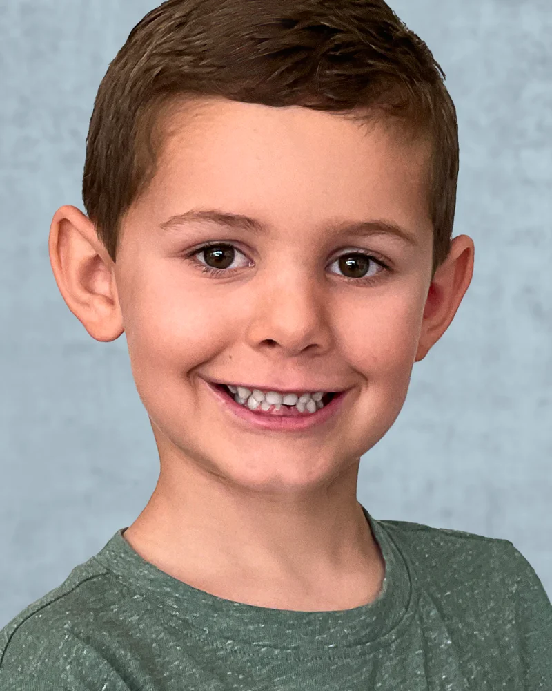
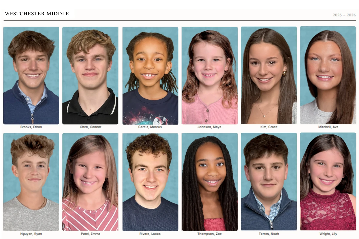
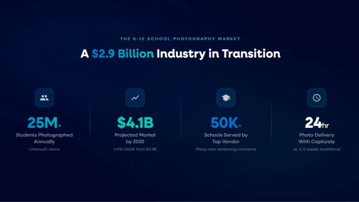
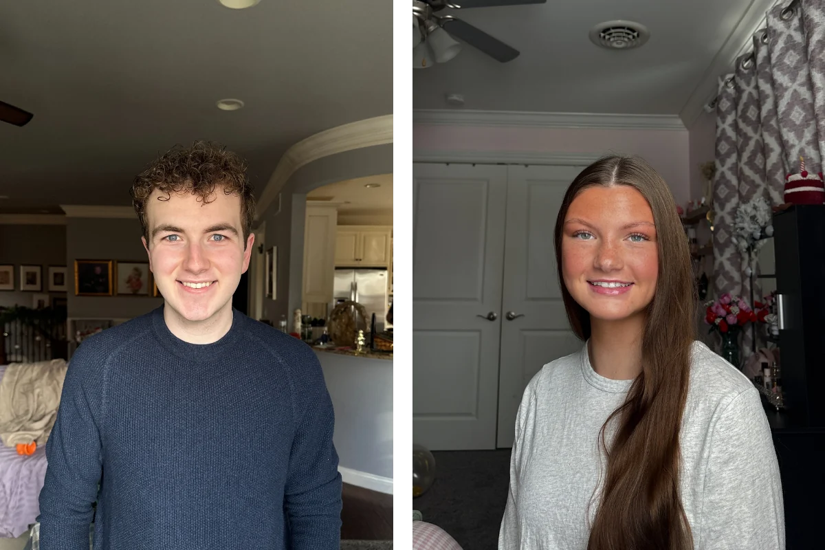
Every modern theme above shares one dependency: the cleaner the design system, the harder the portraits have to work. Grid themes like Composite and Roster, comparison themes like Same Time Next Year, and minimalist type-led themes like What’s Next literally break when portraits vary in crop, lighting, eye-line, or background. Portraits make up as much as 40% of a yearbook, at an average of 12 photos per spread (TreeRing, 2026), so an inconsistent portrait set sabotages nearly half the book’s theme cohesion.
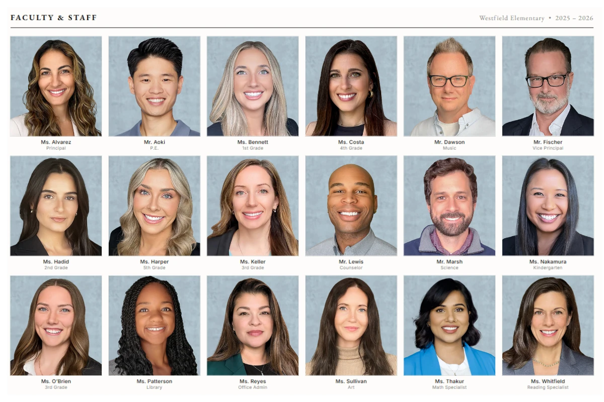
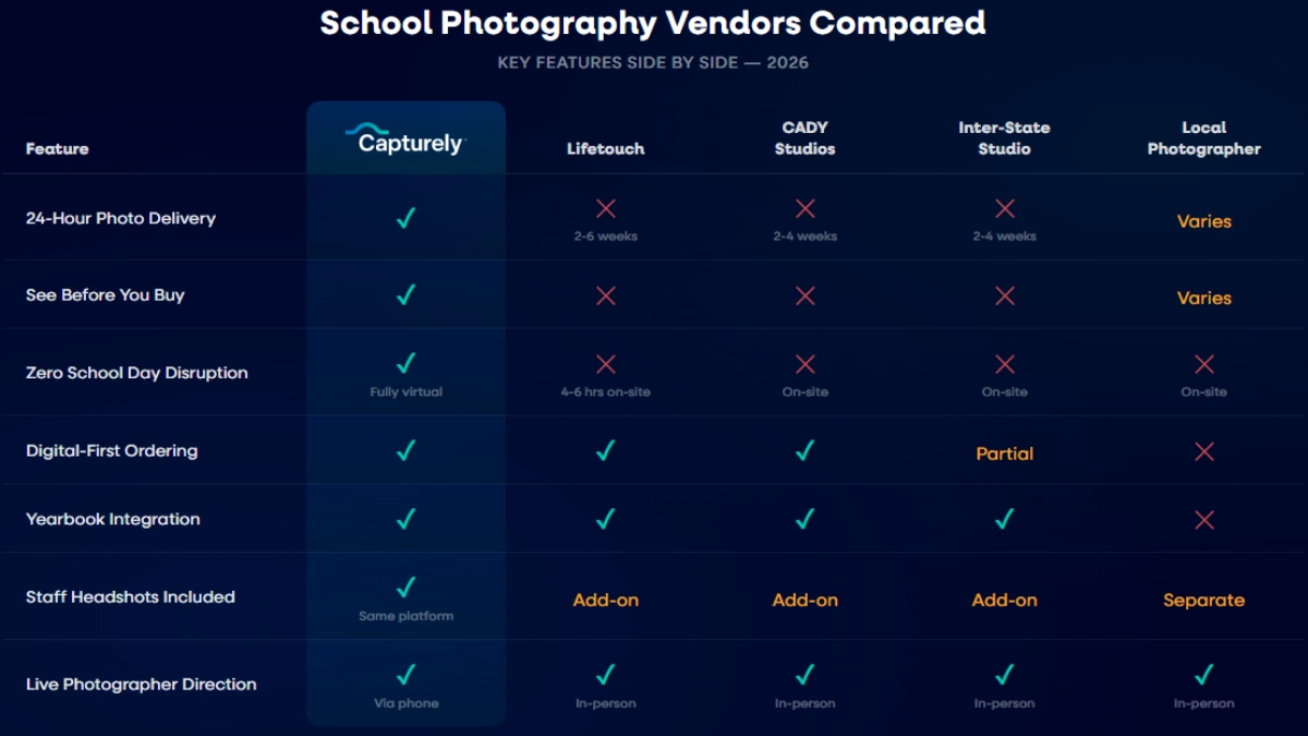
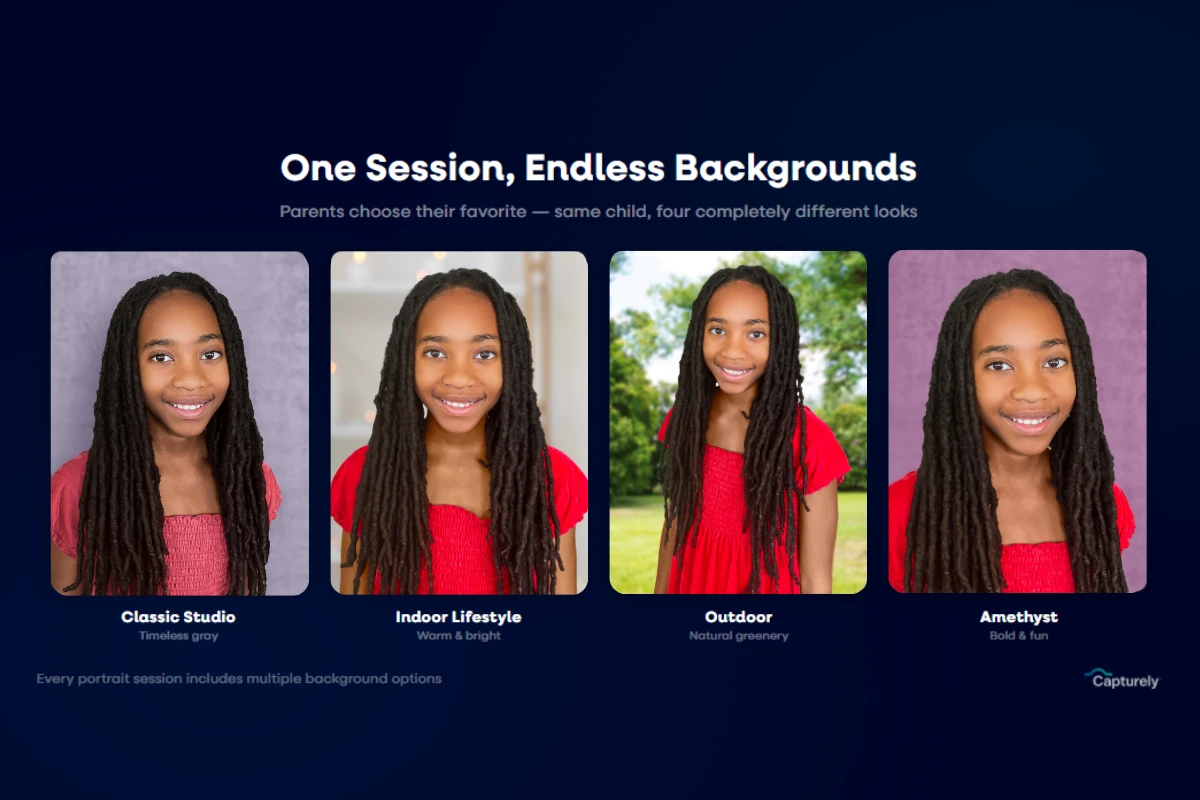
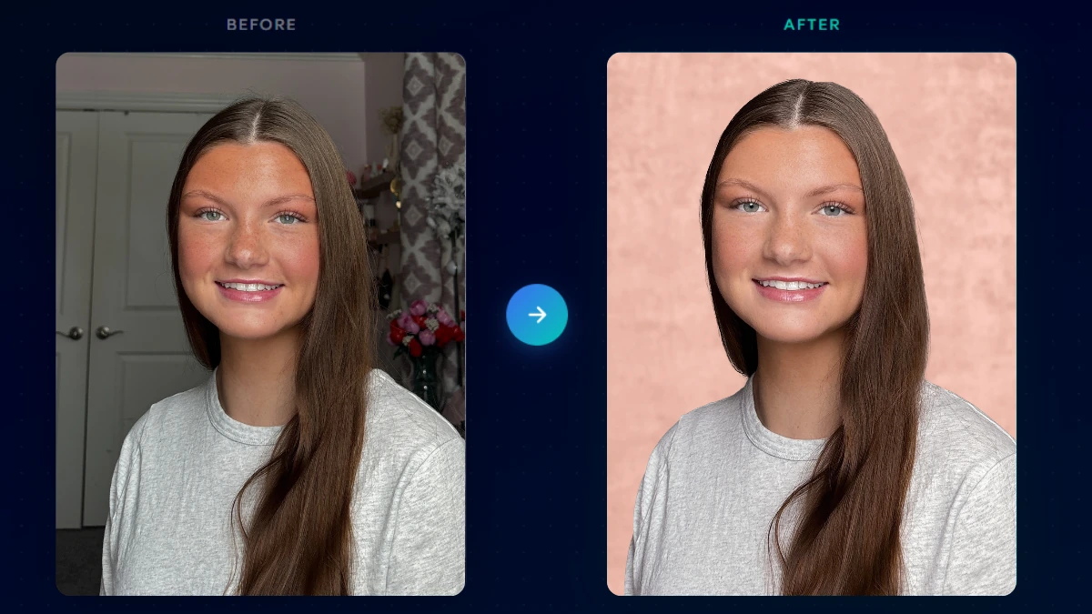
That is exactly the problem with traditional in-person picture day: a rushed gym line, changing light through the day, and a different photographer pace produce a portrait set that never quite matches. A virtual, at-home model fixes it. With Capturely’s virtual school photography, a live professional photographer directs every child through the family’s phone, so every student is shot to one professional standard, same lighting calibration, same background system, same direction, no matter when or where they sat.
| Factor | Traditional in-person picture day | Virtual at-home (Capturely) |
|---|---|---|
| Lighting consistency | Drifts across the day as the gym light changes | Photographer calibrates light for every session |
| Background uniformity | Same backdrop, but inconsistent distance and crop in a fast line | One consistent background system, directed framing |
| Retakes and stragglers | A separate makeup day, often missed | Families reschedule anytime in the window |
| File delivery to yearbook platform | Weeks of waiting, manual matching | High-res files within 24 hours, auto-matched by student data |
| Theme cohesion | Variable portraits weaken grid and minimalist themes | Uniform portraits hold any theme together |
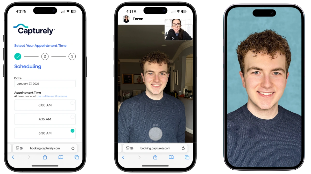
Capturely exports properly formatted, high-resolution portraits straight into the yearbook platform you already use (Jostens, Walsworth, Entourage, Treering), organized by grade and class. Same platform that has delivered more than 100,000 photographer-directed portraits for Google, Netflix, and McKinsey, adapted for students and families. No photographer goes to the building, no class time is lost, and families capture portraits at home on their own schedule.
Want portraits that hold your theme together? Capturely’s at-home sessions deliver consistent, retouched student portraits in 24 hours, exported straight to your yearbook software. Book a school demo →
How Do You Choose a Yearbook Theme?
Pick a theme by starting from your actual year, not a slogan list. Run this process with your staff before anyone designs a cover.
- Brainstorm the story of the year. List what changed, what was new, and what made this year different from the last five. A SWOT or “story of the year” session surfaces themes that feel authentic.
- Apply the cliché test. If the title would fit any school in any year, cut it. Specific beats inspirational.
- Match the theme to your school’s energy. Bold minimalism for a clean editorial book, maximalism for a high-spirit school, natural and organic for a calmer one.
- Build the theme package. Decide cover, palette, two or three fonts, divider style, and photo treatment together, so the idea carries through folios, captions, and the index (JEA, 2026).
- Pressure-test the photography. Confirm your portraits will be consistent enough to support the design. Grid and minimalist themes need uniform crops, lighting, and backgrounds.
- Develop wordplay and spinoffs. Strong themes generate section-specific sub-phrases, not one repeated slogan.
Once the theme is set, the cover comes next. Our guide to yearbook cover ideas that print well pairs tightly with this list, and if you are still choosing tools, see our breakdown of the best yearbook software for 2026. Schools rethinking their whole photography setup can compare Lifetouch yearbook alternatives and review school photography pricing before committing.
Frequently Asked Questions
What is a yearbook theme?
A yearbook theme is the central idea plus the coordinated visual and verbal system, cover, colors, fonts, dividers, captions, and photo style, applied consistently across the entire book. Advisers call this the theme package. It is what makes 200 pages read as one publication for a single school year rather than a scrapbook of unrelated layouts.
What are good yearbook themes for 2026?
Good 2026 themes are specific to your school and year, not recycled slogans. Strong options include Composite, Analog, For You, Now Streaming, Loading, and What’s Next. The 2026 trend split runs from bold minimalism (huge type, white space) to full maximalism (saturated color, layering), with retro futurism and natural-organic styles in between (Walsworth, 2026).
How do you choose a yearbook theme?
Start by brainstorming the story of this specific year, then apply the cliché test: if the title fits any school in any year, cut it. Match the theme to your school’s energy, build a full theme package (cover, palette, fonts, photo style), and confirm your portraits are consistent enough to support the design.
What is a good title for a yearbook?
A good yearbook title is short, specific to your community, and built for wordplay so sections can spin off sub-phrases. JEA’s awards criteria reward titles developed with “visual unifiers and/or wordplay or verbal spinoffs” that fit the school for the current year (JEA, 2026). Avoid vague motivational phrases like “A Year to Remember.”
What yearbook themes should I avoid?
Avoid any theme that could describe any school in any year. The most overused are “A Year to Remember,” “Making Memories,” “Together We Rise,” “United As One,” “Through the Years,” and “We Are [Year].” These read as dated and generic because they say nothing specific about your students or your particular year.
What should I write in my 8th grade yearbook ad?
For a middle school yearbook ad, keep it short and personal: a one-line message to your student, a favorite memory from the year, and a forward-looking note for high school. Pair it with a clear, well-lit photo. Avoid inside jokes that will not age well, since the book is permanent.
Why does photo consistency matter for a yearbook theme?
Because most modern themes, especially grid, comparison, and minimalist designs, break when portraits vary in lighting, crop, or background. Since portraits make up as much as 40% of a book (TreeRing, 2026), inconsistency compounds across nearly half the pages. A virtual, at-home model like Capturely shoots every student to one standard, which keeps any theme cohesive.