Yearbook cover ideas that print well fall into six design styles: minimalist, photo-driven, typography-led, illustration, retro/vintage, and modern grid. The style you choose drives every print decision that follows, from bleed setup and photo resolution to binding type and spine treatment. Below are 25 specific cover ideas with design direction, font pairing notes, and the print requirements each approach demands.
Last updated: June 2026 · Written by Brian Confer, Co-founder of Capturely
Most yearbook cover guides lead with mood boards. This one leads with the press sheet. A cover gets printed at 300 DPI, trimmed with a bleed, and bound in a way that stresses specific design choices. A cover that looks clean on a laptop screen can look terrible off the press. The 25 ideas below are organized around what works visually and why each approach holds up in print.
If you are still locking your concept, our guide to 50 yearbook themes for 2026 covers the story-first approach. Come back here when the theme is set and you are designing the cover itself. For layout software comparisons, see our roundup of the best yearbook software for 2026.
What Makes a Yearbook Cover Work
A yearbook cover does two things: it announces the theme and it survives production. According to the National Scholastic Press Association (NSPA), a strong yearbook cover shows a clear concept, carries the theme visually and verbally, uses dominant imagery effectively, and meets the technical specifications for press. That four-part standard is the filter behind every cover idea in this list.
The most common failure is not bad taste. It is a design that was never built for the physical medium. Colors shift from screen to print. Photos that look crisp at 72 DPI on screen look soft at 300 DPI on paper. Dark cover fields that look solid on a monitor crack or scuff at the spine fold. Every section below includes a print-readiness note for that reason.
According to Mike Taylor, CJE, a journalism specialist and longtime award-winning yearbook adviser, the strongest cover designs begin with a concept decision, not a graphic one. The visual elements need to carry the same message as the theme phrase, not just decorate around it. That principle holds regardless of the style category you build in.
25 Yearbook Cover Ideas by Style
Minimalist Covers (4 Ideas)
Minimalist covers reduce the design to one strong element: a single image, one typographic statement, or one abstract mark. They are the most press-forgiving style because they hold minimal ink coverage, which reduces gradient banding risk and production complexity. They also age well. A minimalist cover from 2016 looks considered. A maximalist one from the same year often looks dated.
1. Single portrait, full-bleed. One student face occupying the full cover, photographed against a clean neutral background. Works best for themes about individuality or identity. Print note: a full-bleed portrait needs at least 300 DPI at 8.75 by 11.25 inches including bleed. A phone’s main rear sensor in natural light achieves this. A selfie camera in a dim hallway will not.
2. Title-only with year. School name, year, and nothing else. The entire title set in a statement typeface at maximum size, no images. Works when the school name or mascot is distinctive enough to need no visual support. Print note: no photos, so production risk is low. Verify that all fonts are embedded in the final PDF and that the background color extends fully through the bleed.
3. One-color with specialty finish. A flat single-color cover in navy, burgundy, or forest, with the school name foil-stamped or embossed. Requires casebound binding to justify the specialty finish cost. Works well for senior editions or milestone years. Print note: request a matte laminate over the base color. It bonds the ink and prevents cracking at the spine fold on dark covers. Confirm foil and emboss minimums with your printer before committing.
4. Cropped object, open field. One meaningful object, a trophy, a science beaker, a worn sneaker, placed on a white or cream background in the lower third. The open space is the design. Font: a neutral grotesque with all weight carried by size. Print note: pure white requires a confirmed stock decision. Ask your printer whether you need coated or uncoated paper before finalizing.
Photo-Driven Covers (4 Ideas)
Photo-driven covers put student, staff, or campus imagery at the center. They are the most popular style because they feel personal and recognizable as a specific school’s book. The technical bar is also the highest: photo quality problems that look acceptable on interior spreads become visible at cover scale.
5. Candid moment, editorial crop. A single candid photo cropped to magazine proportions, preferably a high-expression moment from the school year. Works for documentary-style themes. Print note: candids shot at ISO 1600 or above in gym or auditorium light carry visible digital grain. At cover scale, that grain becomes prominent. Proof-print the image before committing.
6. Two-portrait split. The cover divided vertically into two large portrait photos representing two sides of the school community. Works for contrast or dialogue themes. Print note: the dividing line between photos must be designed intentionally, not as an afterthought. Treat the seam as a graphic element to avoid registration drift at press.
7. Curated portrait collage. Six to twelve student photos arranged in an editorial layout, each selected for expression and light consistency. Different from a mosaic: intentional curation, not systematic tiling. Print note: each photo needs 300 DPI at its printed size. A three-inch print requires a source file of at least 900 pixels on the short edge.
8. Landmark anchor with inset portraits. A wide campus or building photo as the background, with three to five student portraits inset as smaller elements. Creates place-specific identity while keeping people prominent. Print note: building photos taken on the main phone sensor in good daylight are sufficient if the file is not cropped heavily. Avoid wide-angle lens distortion on the building edge.
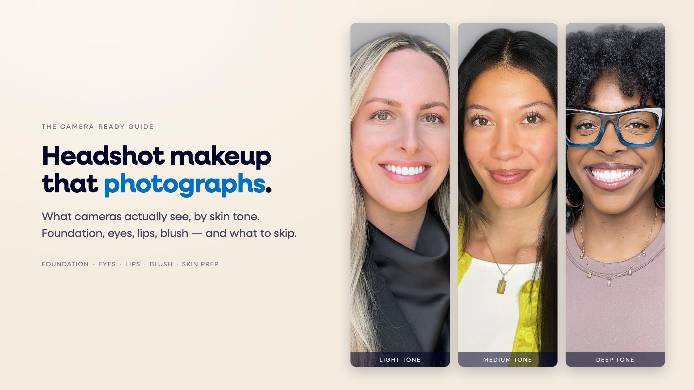
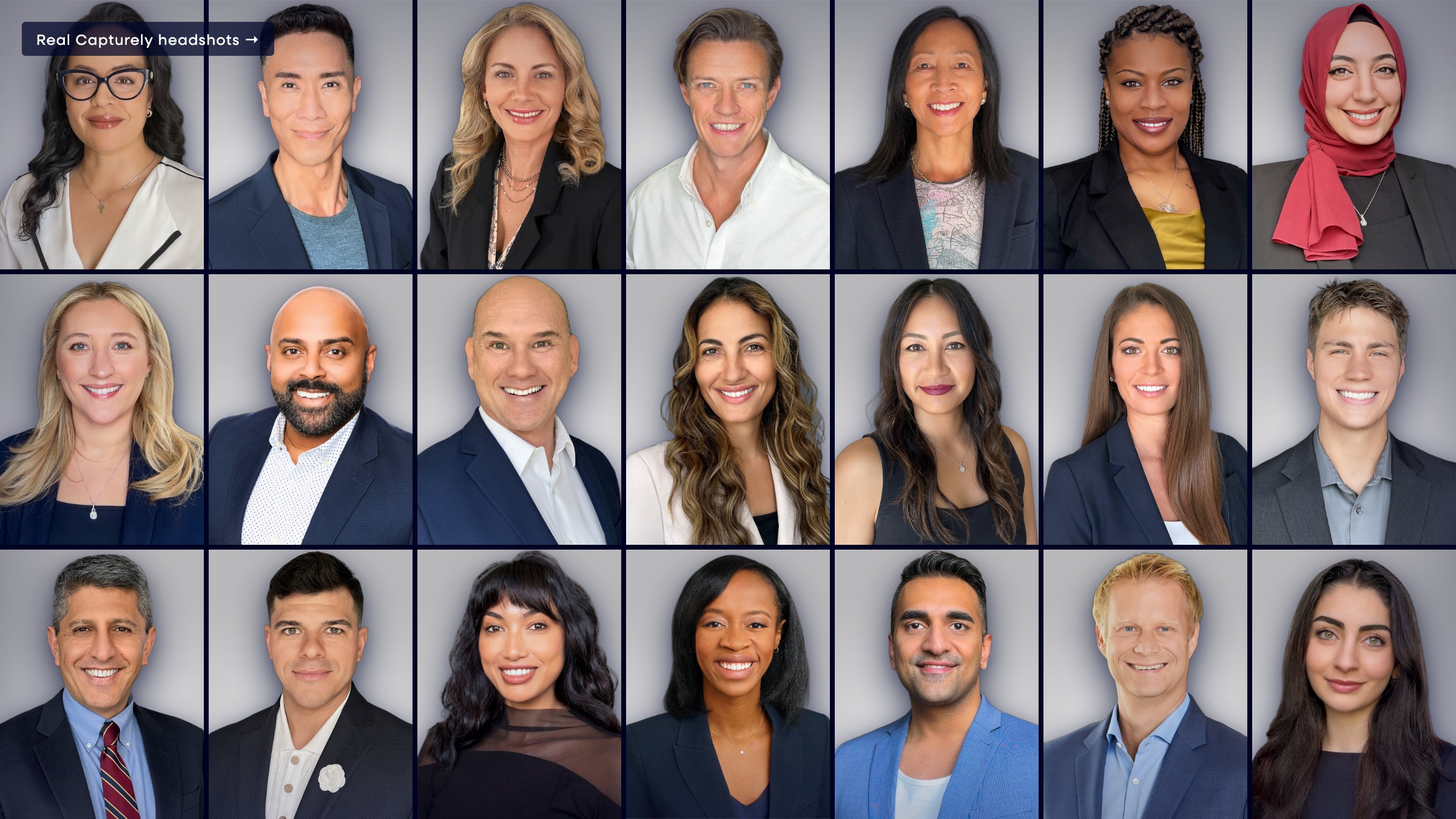
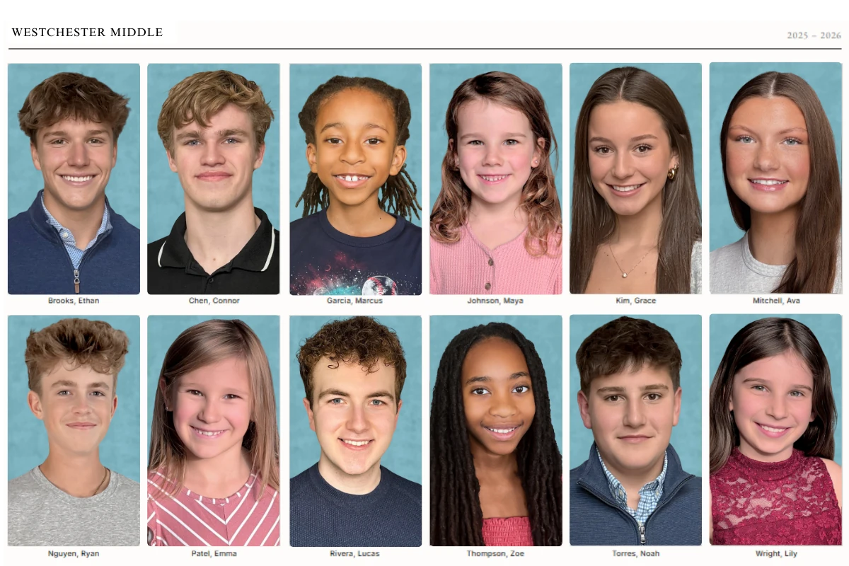
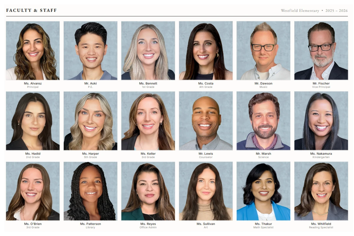
Are portrait photos the weak link in your cover design? Consistent student portraits, same background, same lighting, same crop, are what make a photo-driven cover look intentional rather than patchwork. Capturely delivers directed at-home sessions for every student: families photograph at home and are guided through the session using their phone camera. See how it works →
Typography-Led Covers (4 Ideas)
Typography-led covers make the title phrase or theme words the primary visual. The type is the image. This approach has grown sharply since 2020 as design tools have made expressive lettering accessible to staffs without illustration skills. Done well, it signals a design-confident staff. Done poorly, it reads as understaffed rather than intentional.
9. Oversized single word. The theme word set at maximum type size, filling the cover edge to edge. A portrait or building photo drops behind the letterforms as texture. Font pairings: a wide extended display sans for the theme word, a condensed neutral for the school name and year in a secondary line. Print note: large reversed-out type on a dark background requires clean PDF export. Check for halos or fringing around letterform edges before sending to press.
10. Stacked phrase, alternating weights. The theme phrase broken across three to five lines, alternating between heavy and light weights of the same typeface family. Classic editorial feel. Works for any multi-word theme. Font: a family with a wide weight range. Print note: reversed-out light-weight type on dark backgrounds below 16 point looks soft in print. Test on a proof before finalizing.
11. Letterpress or stamp aesthetic. A hand-stamped or letterpress visual treatment: one ink on a neutral ground, slight ink density variation to simulate the impression. Works for themes with a tactile or craft identity. Font: a block letterpress display face. Print note: simulate the ink variation deliberately. Too much artifice looks noisy; too little looks like a failed print.
12. Split-word reveal. The theme phrase split so part of the word appears on the front cover and part on the back, completing when the book is open. Works for themes about continuity or completion. Print note: requires a perfect-bound or casebound book with a predictable spine width. Calculate spine width first: approximately 0.058 inches per page on standard 60-pound offset paper (Walsworth, 2025). A 200-page book has roughly a 0.46-inch spine.
Illustration and Hand-Drawn Covers (4 Ideas)
Illustration covers separate a book visually from every other school using the same software templates. When the quality holds, they are the most memorable covers in a region. When the illustration quality is inconsistent, it competes with the photography inside in a way that feels disjointed rather than intentional.
13. School mascot, redrawn. The mascot illustrated in a current visual style: bold vector, risograph texture, or flat retro treatment. Font: a display face that matches the illustration style. Print note: vector illustrations scale cleanly to any size. Raster-based illustrations need to be placed at 300 DPI at the final print size of the element.
14. Mixed-media collage. Cut-paper textures, hand-lettered type, and photo fragments layered into one composition. Works for arts-focused schools or themes about creativity. Print note: flattened collage files can reach very large file sizes. Export as a press-quality PDF, not a JPEG, to preserve fine detail in the texture layers.
15. Line drawing of the building. A detailed ink-line illustration of the school building or a specific campus landmark, uncolored or with one spot color. Works for place-rooted themes. Font: an architectural monospace or a clean serif for the title block. Print note: fine-line illustrations need 600 DPI or higher for crisp offset reproduction. At 300 DPI, thin lines can look soft.
16. Student-drawn panel. A single illustration or comic panel featuring student characters, drawn by a student on the staff or through an open submission. Works for community-built themes that emphasize student voice. Print note: work at 300 DPI native in the drawing software. Do not scale up after the fact.
Retro and Vintage Covers (4 Ideas)
Retro covers borrow visual codes from a specific historical period: the bold graphic conventions of the 1970s, the tactile imperfection of the 1980s, the chromatic excess of the 1990s, or the early-internet lo-fi of the early 2000s. They work because the design constraints of each era, limited palettes, characteristic type, specific textures, function as ready-made systems a staff can apply directly.
17. 1970s editorial bold. Saturated primaries, a thick black border, a big headline, and a strong portrait, modeled on 1970s magazine cover conventions. Font: a condensed slab serif or bold extended display. Color: mustard, rust, and black. Print note: saturated warm colors reproduce predictably in CMYK. Convert to CMYK before finalizing and confirm that mustard does not shift toward olive or khaki in the proof.
18. 1980s neon palette. Electric backgrounds, chrome-style gradients, and Miami Vice colors. Works for themes that lean into 80s nostalgia explicitly. Font: a retro chrome display or italic techno face. Color: hot pink, electric blue, chrome. Print note: electric neons are difficult to reproduce in CMYK. Bright cyan-blues and magentas can shift significantly in print. Order a proof printed on the actual stock before approving.
19. Worn photo album. Sepia or faded-color palette, kraft paper texture, and photos styled to look like they were laid on a flatbed scanner. Works for memory and time themes. Font: a warm script for accent, a readable serif for the title block. Print note: heavily textured backgrounds can trap ink unevenly on certain stocks. Print a physical proof before approving the final file.
20. Early 2000s chrome digital. Glossy chrome type, pixelated gradients, and a retro browser or loading-screen aesthetic. Works for internet-era nostalgia and Y2K themes. Font: a techno or chrome display face. Color: silver, black, electric blue. Print note: chrome effects are difficult in CMYK. Matte laminate will dull chrome visuals. For genuine reflective chrome, ask about foil stamping on specific type elements rather than trying to reproduce it in CMYK ink.
Modern Grid Covers (5 Ideas)
Modern grid covers apply systematic layout structures, mosaic photo arrays, and modular design units. They are the most technically complex to produce but also among the most impactful when photo consistency is high. The grid is only as strong as its weakest cell: one mismatched background or off-crop portrait disrupts the entire composition.
21. All-school photo mosaic. Every student, or every member of a grade, arranged as a dense portrait mosaic filling the full cover. The NSPA has recognized this format as one of the strongest visual statements a yearbook can make when every portrait matches in background, lighting, and crop. Print note: each portrait cell in a 400-student mosaic might print at roughly 0.5 by 0.6 inches. At that size, each source file needs at minimum 150 DPI at its printed dimensions to show a recognizable face.
22. Six-portrait gallery with title block. Six large student portraits in a two-by-three grid, each on a consistent color background, with a clean title block at the bottom. Simpler to produce than a full mosaic but carries the same visual argument. Font: a clean geometric sans for the title block. Print note: consistent background color across all six photos is not optional. Even minor white-balance variation between photos reads as sloppy when the cells sit next to each other at this scale.
23. Panoramic cover, spine included. One continuous image running across the back cover, spine, and front cover. Works for landscape campus shots or crowd photographs. Print note: the spine width must be calculated before the design is started. Build the full cover as a single canvas including back, spine, and front, and lock the spine width before placing any images.
24. Class panels, tiled. Separate portrait-grid panels per grade, each showing a four-by-six arrangement of that class, arranged as labeled tiles on the full cover. Works for larger schools where an all-school mosaic makes individual faces too small to recognize. Print note: panel boundary rules need to print cleanly. Confirm minimum line weight with your printer, typically 0.25 point minimum for offset.
25. Color-cell portrait grid. A grid of consistent student portraits, each placed on a cell colored in one of two or three theme palette colors, creating a quilt or color-block visual. The photo composition is uniform; the color variation comes from the cell backgrounds only. Print note: define the palette colors in CMYK, not RGB. What looks right on screen in RGB can shift significantly in print, especially blues and purples.
5 Mistakes That Ruin a Yearbook Cover at the Printer
These technical errors appear on covers designed beautifully on screen and then printed badly. Every one of them is preventable when you build for print from the start.
1. Insufficient Bleed
Bleed is the extension of your background and edge elements beyond the trim line. Standard bleed for most yearbook printers is 0.125 inches on every side. Some require 0.25 inches. If your design does not extend to the bleed edge, you get thin white slivers at the cover edges after trimming, regardless of cutter accuracy. Set up the bleed before designing, not as a post-production fix.
2. Low-Resolution Photos
Web images are typically 72 DPI. Print requires 300 DPI at the printed size. A photo that looks correct on screen at 72 DPI will print at roughly one-sixth of its apparent size before it pixelates. Current smartphones shooting on the main rear sensor produce files well above 300 DPI at standard cover size: 36 to 48 megapixels on recent flagships (Apple, 2024; Samsung, 2025) is substantially more than the approximately eight megapixels required for 300 DPI at 8.5 by 11 inches. The risk is using selfie-camera or heavily compressed files, not the phone itself.
3. Dark Covers Cracking at the Spine
A full-bleed solid black or dark navy cover carries maximum ink saturation. When the book bends at the spine, the ink layer cracks or scuffs. This is especially visible on softcover and saddle-stitched books. Three fixes: request a UV matte coating from your printer, reduce ink coverage slightly in a one-inch strip along the spine in the design file, or choose casebound binding where the cover board does not flex the same way a soft cover does.
4. Gradient Banding
Gradient banding is the visible stair-stepping in what should be a smooth color transition. It happens when a gradient is created in RGB and converted to CMYK for press, because the CMYK gamut is narrower and the conversion reduces the available color steps. It also happens on gradients spanning a large area at insufficient bit depth. Fix: design all gradients in CMYK from the start, add two to three percent grain or noise to the gradient layer to break up the steps, and export as a press-quality PDF rather than a compressed image file.
5. RGB Color Mode
Screens use RGB. Printers use CMYK. A file built in RGB and submitted to press gets converted at the printer, and the conversion is unpredictable, particularly for blues, purples, and vibrant greens that exist in the RGB gamut but have no close CMYK equivalent. Convert to CMYK in your layout software before submitting and check the preview for any colors that shift unexpectedly on conversion.
How Student Photo Quality Makes or Breaks a Grid Cover
Every modern grid cover style from ideas 21 through 25 depends on portrait consistency. The grid is a system: one outlier disrupts every cell around it. A student photographed against a white wall, surrounded by students against a blue backdrop, creates a hole in the mosaic that no layout software fixes after the fact.
Traditional picture day produces inconsistent results because it sends photographers to different buildings on different days with different equipment. Background color shifts between setups. Lighting changes between morning and afternoon sessions. One photographer handles the middle school differently than the one who covered the elementary building. The yearbook staff normalizes portraits in the layout software by hand, which takes hours and still produces mediocre grids.
| For photo-grid cover quality | Traditional picture day | Capturely at-home directed portraits |
|---|---|---|
| Background consistency | Varies by building, gym, and backdrop setup | Uniform across every student |
| Lighting and color balance | Mixed sources, shifts through the day | Photographer-directed and consistent |
| Framing and crop | Drifts between photographers and sessions | Same head size and crop for every portrait |
| Resolution for print | Depends on vendor equipment, often tight for full-cover mosaic | Rear camera, 36–48 megapixels, print-ready files |
| Delivery for layout | 2 to 6 weeks for digital proofs from most vendors | 24 hours, exported cleanly into any layout platform |
| Result at the grid | Background and crop mismatches the staff patches by hand | Portrait grid ready for direct placement |
Capturely is the virtual school portrait platform that produces the right-hand column above. A school distributes session links to families. Parents open the link at home, and are guided through a session using their phone camera in real time. The school gets consistent, print-ready portraits delivered in 24 hours, without a single picture day on the calendar. Real photos, real photographers, no AI slop.
For more on the model, see our guide to virtual school photography and the best school photography companies comparison. Schools evaluating after a recent vendor change can start with our Lifetouch yearbook alternatives list.
Building a grid cover for next year’s book? Get consistent, print-ready student portraits with zero picture day logistics. Request a free single-grade pilot and see what a uniform portrait grid looks like before committing to a vendor. Request a free pilot →
Frequently Asked Questions
What size should a yearbook cover be?
The standard yearbook cover is 8.5 by 11 inches in portrait orientation. This matches the most common trim size offered by major yearbook printers including Walsworth, Jostens, Treering, and Pictavo. Design at this size plus a 0.125-inch bleed on all four sides, totaling 8.75 by 11.25 inches, with a safe zone of at least 0.125 inches inside the trim edge for the school name, year, and any other critical content.
Do yearbook covers need to match the theme exactly?
The cover must establish the theme clearly. The NSPA’s judging criteria evaluate whether the cover reflects the theme and whether the visual and verbal messages align (NSPA, 2025). That does not mean the cover must include every theme element. It means the design direction, color palette, typography, and imagery should be unmistakably connected to the theme phrase and carried consistently through the book.
How do you fit 400 student photos on a yearbook cover?
A 400-student photo mosaic on a standard 8.5 by 11 cover gives each portrait approximately 0.5 by 0.6 inches of print space. At that size, each source file needs at minimum 150 DPI at its printed dimensions to show a recognizable face. Every portrait must use a consistent background color and uniform crop. Inconsistent backgrounds make the mosaic look like a grid of errors rather than an intentional design.
What is the best binding for a photo-grid yearbook cover?
Perfect binding (glue spine) or casebound (hardcover) both work well for grid and mosaic covers. Saddle stitch is viable for books under 80 pages but has no spine and limits the panoramic wrap format. Casebound is the best choice for high-volume all-school mosaic covers because the cover board does not flex the same way a soft cover does, reducing cracking at the spine fold on dark or high-ink-coverage designs.
Can you use the same yearbook cover format every year?
A design system is different from a repeated cover. Using a consistent format, such as an all-school mosaic every year, can become a recognizable school tradition. The photos change, the theme phrase and palette change, and the specific typographic treatment changes. Several award-winning programs have built lasting visual identities around a consistent structural format, with annual variation expressed through type and color rather than a full redesign each cycle.
What resolution do yearbook cover photos need?
300 DPI at the printed size is the standard for all cover images. For a photo filling the full 8.5 by 11 cover, the source file needs at least 2,550 by 3,300 pixels. Most current smartphones on the main rear sensor produce files well above this threshold. Web-exported or heavily compressed images typically do not meet this standard and will look soft in print, even if they appear sharp on screen.
What yearbook cover ideas work for elementary schools?
Elementary school covers work best when they feel warm, accessible, and celebratory. The most effective styles are photo-driven covers with student faces prominent, bright and clean color palettes, and simple typography readable by families. Illustration covers with student-drawn or teacher-drawn artwork also perform well at the elementary level. Avoid heavy all-type treatments or dark-dominant designs that read as corporate rather than community.
Ready to see what consistent portraits look like for your school? Capturely delivers photographer-directed at-home student sessions. Families photograph at home on their own schedule and the school gets print-ready portraits in 24 hours. No picture day required. Learn how it works →