Your headshot background does more work than you think. It sets the mood before anyone reads your name. It signals whether you’re corporate or creative, traditional or modern, approachable or authoritative — all in the fraction of a second before they register your face.
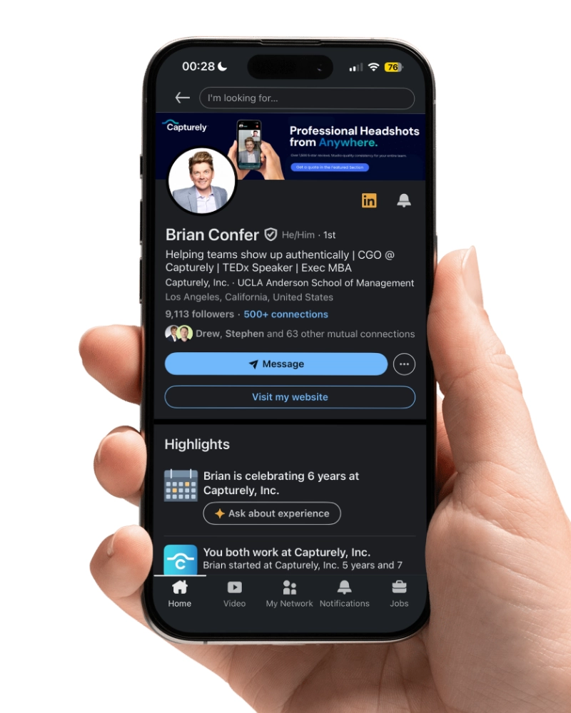
Last updated: March 15, 2026 · Written by Brian Confer, Co-founder & COO at Capturely
Research from the University of Winnipeg found that people form judgments within 90 seconds of seeing someone, and 62-90% of that assessment is based on color alone. Your professional headshot background isn’t decoration. It’s your first argument.
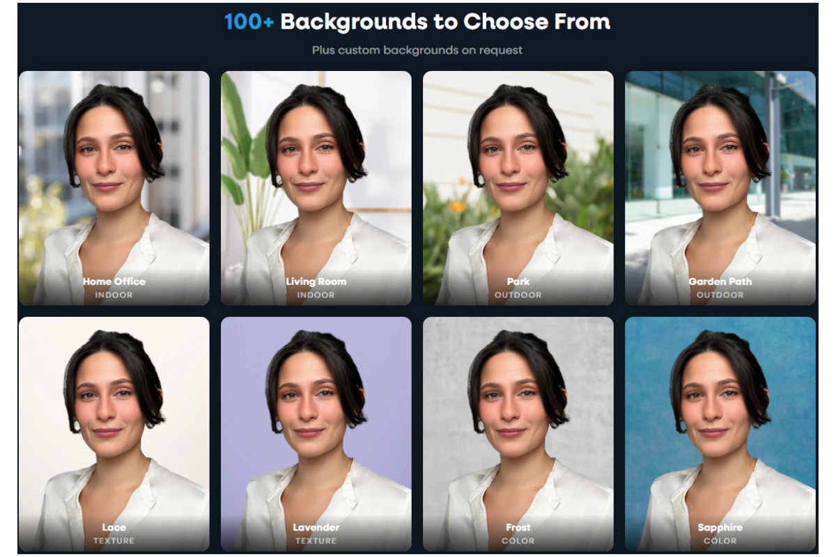
Capturely offers 98+ background options for virtual headshot sessions — solid colors, gradients, textures, and custom branded designs. After directing 100,000+ headshots for companies like Google, McKinsey, and UnitedHealth Group, we’ve seen which backgrounds work, which ones distract, and which ones people regret. Here are the 15 that actually matter, when to use each one, and how to pick the right one for your industry.

What Your Headshot Background Communicates (Before You Say a Word)
Background color isn’t just aesthetic preference. It’s psychology.
A study published in the Journal of Marketing & Social Research found that blue backgrounds triggered associations with trust in 74% of participants and competence in 68%. Separate research in the Journal of Experimental Psychology confirmed that faces presented against blue backgrounds were rated as more trustworthy than faces against other colors.
Gray communicates neutrality, formality, and sophistication — which is why financial institutions and law firms gravitate toward it. White signals clarity and premium quality. Black conveys authority and creative edge. Warm tones like beige and taupe read as approachable and grounded.
This isn’t abstract theory. These associations shape whether a recruiter clicks your LinkedIn profile, whether a patient trusts your provider directory photo, whether a client responds to your proposal. The University of Loyola found that consistent color use increases brand recognition by up to 80%. Your headshot background is part of your brand — whether you’ve thought about it that way or not.

15 Professional Headshot Backgrounds (With When to Use Each)
Not every background works for every situation. Here are the 15 most effective options, organized from the most traditional to the most creative, with specific guidance on who should use each one.
1. Classic White
Clean, bright, medical-grade professional. White backgrounds strip away all context and put 100% of the focus on your face. They’re the default in healthcare provider directories, government agency headshots, and passport-style corporate photography.
Best for: Healthcare providers, government employees, academic faculty, anyone whose organization requires a standardized, no-frills look.
Watch out for: Pure white (#FFFFFF) can look harsh — it reflects too much light and creates unflattering shadows under the chin and around the eyes. A slightly warm white or off-white is usually more flattering, especially for lighter skin tones where the contrast can wash you out.
2. Light Gray
The single most popular professional headshot background, and for good reason. Light gray works across every skin tone, every industry, and every platform. It’s neutral without being sterile, professional without being boring.
Best for: Finance, consulting, insurance, legal — any industry where you want to look polished without making a statement. Also the safest choice when you’re not sure what to pick.
Why it works: Gray is associated with professionalism, logic, and impartiality. It doesn’t compete with your clothing, your expression, or your skin tone. It just frames you. When 80% of professionals say they prefer a simple, non-distracting background for their headshot, gray is usually what they mean.

3. Charcoal / Dark Gray
Darker than standard gray but softer than black. Charcoal backgrounds add weight and authority without the dramatic edge of full black. They’re trending upward in 2025-2026 — dark neutrals are the fastest-growing background category in corporate photography.
Best for: Executive portraits, leadership team pages, financial services, luxury brands. Anyone who wants to project gravitas.
The difference from black: Black backgrounds can feel severe or theatrical. Charcoal gives you the same authority with more subtlety. On LinkedIn’s small circular crop, charcoal backgrounds maintain enough contrast to make your face pop without disappearing into the platform’s dark mode interface.

4. Navy Blue
Blue is the most trusted color in business. There’s a reason roughly 33% of the world’s top brands incorporate blue in their logos — and roughly half of the top 500 global brands use it somewhere in their visual identity.
In headshot photography, navy blue backgrounds convey trust, stability, and competence. A study published in the Journal of Marketing Theory and Practice found that when brand elements were presented in blue, participants consistently rated them as more trustworthy — by a ratio of nearly 3 to 1 over other colors.
Best for: Finance, insurance, banking, corporate law, technology, consulting. Any client-facing role where trust is the currency.

5. Teal / Turquoise
A modern alternative to standard blue. Teal backgrounds land between professional and creative — forward-thinking without being casual. They photograph beautifully across a wide range of skin tones and stand out in a sea of gray-and-navy headshots on a company’s “Meet the Team” page.
Best for: Tech companies, startups, marketing agencies, healthcare organizations that want to look innovative. If your company’s brand leans modern, teal bridges professionalism and personality.

6. Black
Dramatic, editorial, high-contrast. Black backgrounds make your face the sole focus — every line, every expression, every detail is amplified. That’s either a feature or a bug, depending on the context.
Best for: Actors, creative professionals, executive speakers, personal brand photography, entertainment industry. Also works well for leadership pages at luxury or design-focused companies.
The risk: Black backgrounds can feel heavy or unapproachable in the wrong context. A real estate agent on a black background looks like they’re selling mystery, not houses. A pediatrician on a black background might unnerve the parents browsing the provider directory. Know your audience.

7. Warm Neutrals (Beige, Taupe, Cream)
Warm backgrounds add softness that cool grays can’t match. They read as approachable, inviting, and human. There’s a warmth that makes the viewer feel like they’re meeting someone they’d enjoy talking to — which is exactly the point for client-facing roles in service industries.
Best for: Real estate agents, therapists, wellness professionals, coaches, non-profit leaders, education. Any role where approachability matters more than authority.
Technical note: Warm neutrals are sensitive to white balance. If your lighting runs cool (bluish), a beige background can shift to a muddy gray on camera. This is one area where having a photographer who can see the result in real time makes a measurable difference — they’ll catch the color shift before you end up with a background that doesn’t match what you chose.
8. Soft Gradient
A subtle transition from one shade to another — usually lighter at the center (behind your face) fading to darker at the edges. Gradients add depth and dimension that flat solid colors can’t. They create a natural “spotlight” effect that draws the eye to your face without any visible light source.
Best for: Anyone who wants something more visually interesting than a flat solid but less dramatic than a textured or environmental background. Gradients work across most industries and photograph well on every platform.
Trending: Subtle gradients are replacing flat solids as the default corporate headshot background in 2026. The shift is driven partly by how they display at different sizes — a gradient holds visual interest even when cropped to LinkedIn’s tiny circular thumbnail.

Can’t decide on a background? Capturely offers 98+ options — solids, gradients, textures, and custom branded designs. Choose during your session, or let your photographer recommend one based on your industry and wardrobe. See all background options →
9. Textured / Abstract
Painted canvas, brushed concrete, subtle linen — textured backgrounds add tactile depth that flat colors lack. The texture is visible but shouldn’t be distracting. Think “interesting wall” rather than “wallpaper pattern.” The best textured backgrounds have enough variation to feel organic without competing with your face for attention.
Best for: Creative industries, architecture firms, design agencies, boutique consultancies. Anyone whose brand leans artisanal, handcrafted, or design-forward.
Watch out for: Strong patterns (geometric, striped, floral) create moiré effects on digital screens and can vibrate visually when compressed for web use. Subtle, organic textures work. Busy patterns don’t.
10. Custom Branded
Your company’s exact colors, gradient, or even logo integrated into the headshot background. Branded backgrounds are the fastest-growing category in enterprise headshot photography — and the most underused. When every employee’s headshot sits on the same branded background, your team page stops looking like a random collage and starts looking like a unified organization.
Best for: Companies going through a rebrand, organizations with strict visual identity guidelines, teams that appear together on conference materials, investor presentations, or public-facing directories.
How it works at Capturely: Custom backgrounds cost a one-time $200 setup fee. You send us your brand guidelines, colors, and any specific elements you want incorporated. We build the background, you approve it, and every employee who books a session can use it. It’s how companies like AT&T and Paramount maintain visual consistency across hundreds of headshots taken at different times in different locations.

11. Office / Environmental
An actual office, workspace, or professional environment — slightly blurred behind you. Environmental backgrounds add context. They tell the viewer where you work and what kind of work you do. A doctor in a clinical setting. A chef in a kitchen. A startup founder in a co-working space.
Best for: Roles where your environment IS your credibility — chefs, architects, lab researchers, tradespeople, anyone whose workspace tells a story that a gray wall can’t.
The catch: Environmental backgrounds are harder to execute well. The background needs to be blurred enough to not distract but sharp enough to be recognizable. The lighting has to work for both you and the space. And the environment has to actually look good — a cluttered desk with a half-eaten lunch doesn’t project the image you’re going for.
12. Outdoor / Natural
Trees, architecture, urban landscapes, park settings — shot with enough depth of field to soften the background while keeping you sharp. Outdoor backgrounds feel relaxed and human. They can also signal creativity, independence, or an unconventional approach to your profession.
Best for: Real estate agents, wellness professionals, outdoor industry, non-profits, education, coaches. Any field where “stuffy” is the enemy.
The quality gap: Outdoor backgrounds done well look incredible. Outdoor backgrounds done poorly (harsh midday sun, busy intersections, other people in frame) look amateur. Timing, location, and photographer skill matter far more here than with solid colors, where the background is essentially foolproof.
13. Bokeh / Blurred
Any background rendered into soft, abstract circles of light. Bokeh backgrounds (from the Japanese word for “blur”) create a dreamy, high-production look that screams “professional photographer took this.” The specific pattern of the bokeh — the size, shape, and color of the light circles — depends on the lens, aperture, and light sources behind you.
Best for: Personal brand photography, creative professionals, headshots intended for social media rather than corporate directories.
Photographer tip: Bokeh backgrounds are trending on Instagram and personal brand content, but they’re less common in corporate settings. If your headshot needs to sit alongside 30 coworkers on a team page, a bokeh background will stick out — and not in the way you want. Save it for individual profiles and personal branding.
14. Earth Tones (Sage, Olive, Warm Brown)
Muted greens, dusty browns, warm stones. Earth tone backgrounds are having a moment — driven by the broader design trend toward organic, natural, sustainability-signaling aesthetics. They feel grounded, authentic, and calming.
Best for: Sustainability-focused brands, wellness and healthcare, non-profits, education, food and agriculture, environmental organizations. Also works well for therapists and counselors, where a calming background matters.
Skin tone consideration: Earth tones pair particularly well with warm skin tones but can sometimes clash with cooler undertones. If you have fair skin with pink undertones, sage green can make you look washed out. A photographer who can see the combination in real time helps you avoid this — another reason live direction beats choosing a background from a dropdown menu.

15. Warm-Toned Studio
Amber, rose, soft copper — warm studio tones create an intimate, editorial feel. These backgrounds are the furthest from “standard corporate headshot,” which is exactly the point. They signal that you (or your company) made a deliberate aesthetic choice, not a default one.
Best for: Hospitality, beauty, fashion, interior design, media, entertainment. Creative leaders and personal brand builders who want their headshot to feel more like a magazine editorial.
Not for: Traditional corporate, finance, law, government. A warm rose background on a bank’s advisory team page would look like someone made a mistake.

How to Choose the Right Background for Your Industry
Different industries have different expectations. Here’s a quick reference for matching your headshot background to what your audience expects to see.
| Industry | Recommended Backgrounds | Why |
|---|---|---|
| Finance / Banking | Navy blue, light gray, charcoal | Trust and authority are the top priorities. Blue drives trust perception in 74% of viewers. |
| Healthcare | White, light gray, light blue | Clean, clinical, trustworthy. Patients browsing provider directories respond to simplicity. |
| Legal | Charcoal, navy, dark gray | Authority and gravitas. Darker tones project the seriousness clients expect from counsel. |
| Technology | Teal, blue, gradient, branded | Innovation-forward. Modern colors signal a forward-thinking company culture. |
| Consulting | Light gray, navy, charcoal | Professionalism and neutrality. Your headshot shouldn’t distract from your expertise. |
| Real Estate | Warm neutrals, outdoor, light blue | Approachability wins deals. Warm backgrounds mirror the warmth clients want from their agent. |
| Education | Light gray, warm neutrals, earth tones | Friendly, approachable, non-intimidating. Faculty should look like someone you’d want to learn from. |
| Creative / Design | Black, textured, bokeh, warm studio | Creative backgrounds demonstrate that you practice what you preach. Aesthetic choices are proof of taste. |
| Non-Profit | Earth tones, outdoor, warm neutrals | Human, grounded, mission-driven. Nature-inspired backgrounds reinforce values-based organizations. |
| Insurance | Navy, light gray, branded | Trust-first, then consistency. Companies like Allianz standardize across national teams. |
This table is a starting point, not a rulebook. Your specific company culture matters more than your industry’s default. A tech startup might go with black backgrounds for an edgier brand, while a conservative law firm might choose light gray over charcoal. The key is intentional choice — picking a background because it communicates something specific, not because it happened to be available.
For a deeper dive on wardrobe choices that complement these backgrounds, see our guide on what to wear for professional headshots.
Need backgrounds matched to your brand? Capturely creates custom branded backgrounds for $200 (one-time). Your colors, your guidelines, applied to every headshot across your team. Get a custom background quote →
Background Mistakes That Make You Look Amateur
After 100,000+ headshots, Capturely’s photography team has seen every background mistake. These are the ones that show up on team pages and LinkedIn profiles every single day.
The Bathroom Selfie Background
Mirror, towel rack, toilet just barely cropped out. It happens more often than you’d think. Even if you crop it tightly, the lighting in bathrooms (overhead fluorescent, usually) creates unflattering shadows under your eyes and greenish skin tones. If you wouldn’t hold a client meeting there, don’t take your headshot there.
The Busy Bookshelf
A bookshelf CAN work as an environmental background — if it’s organized and blurred slightly. What doesn’t work: a cluttered shelf with coffee mugs, random tchotchkes, kids’ artwork, and a copy of “Who Moved My Cheese” visibly spine-out. The viewer spends more time reading your shelf than looking at your face.
The Cropped Group Photo
Someone else’s arm draped across your shoulder, cropped at the elbow. A wedding gown or tuxedo peeking in from the edge. “I get a dollar for every wedding photo that was like 15 years old with the wife or the husband cut out,” one HR director told us. If it’s obvious you were cropped out of a larger scene, the viewer’s first impression isn’t “professional” — it’s “couldn’t be bothered.”
The Inconsistent Team Page
This is the biggest background mistake in corporate photography — and it’s not about any single headshot. It’s about what happens when you have one person on white, another in a park, another against exposed brick, three people with no headshot at all, and someone using their Instagram profile pic from 2018. Research shows 47% of brand perception is based on visuals, and an inconsistent team page undermines every claim of professionalism on your website.

Why Background Consistency Matters for Teams
Individual headshot background choice is a personal decision. Team headshot background choice is a brand decision.
Lucidpress (now Marq) found that companies with consistent brand presentation see a 23-33% increase in revenue compared to inconsistent brands. Over two-thirds of businesses surveyed linked brand consistency to at least 10% revenue growth. And 90% of consumers expect a consistent experience across different platforms.
Your team page is one of those platforms. When every headshot uses the same background, cropping, and style, you communicate three things without saying a word: we’re organized, we’re professional, and we pay attention to details. When headshots are a mismatched patchwork, you communicate the opposite.
The challenge is logistics. If your team is in four cities — or forty home offices — how do you get everyone on the same background? Traditional studios can’t solve this. You’d need to book multiple studios, brief multiple photographers, and hope the lighting and color calibration match across locations. They won’t.
This is where virtual headshot sessions change the equation. At Capturely, every employee connects with a photographer through a phone link — no matter where they are. The background is applied digitally during retouching, which means everyone gets the exact same background regardless of whether they shot from Manhattan, rural Indiana, or their kitchen table. Same color. Same tone. Same brand. One vendor, one process, one look across the entire team.
That’s how companies like Amazon, AT&T, and Capital One maintain visual consistency across thousands of employees. Not by coordinating photo days at 40 offices. By eliminating the variable entirely.
For a full overview of how corporate teams manage headshots at scale, see our corporate headshots guide.

How Virtual Headshot Backgrounds Work
If you’ve only ever shot headshots in a studio, the concept of choosing a background after the fact feels strange. Here’s how it works.
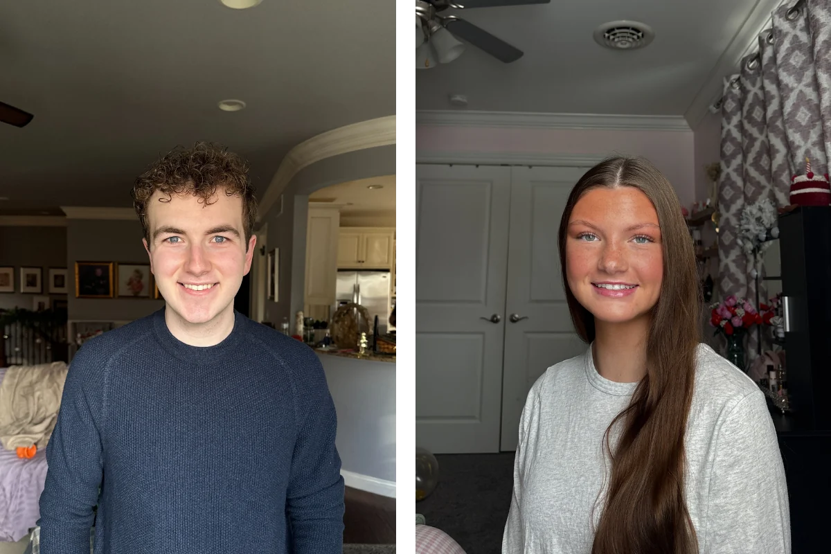
During a Capturely session, a live photographer directs you through your phone’s rear camera — like a FaceTime call, but you’re using the high-resolution back camera (36-48 megapixels). The photographer coaches your posture, expression, lighting, and framing in real time. After the session, the retouching team replaces your actual background with your chosen option from 98+ professional backgrounds.
The result is indistinguishable from a studio shot. The lighting on your face matches the background tone. The edge separation looks natural. The color grading ties everything together. But you shot it from your living room in 10 minutes.
The advantage isn’t just convenience. It’s flexibility. You can:
- Choose your background AFTER seeing your photos — no guessing before the shoot
- Get the same headshot on multiple backgrounds for different uses (LinkedIn vs. company website vs. conference bio)
- Change your background later if your company rebrands
- Standardize every employee on the same background, regardless of when or where they shot
Custom branded backgrounds — your company’s colors, gradient, or logo — cost a one-time $200 setup fee. Once built, every employee can use it. Standard backgrounds from the 98+ library are included in every session at no extra cost.
For a complete walkthrough of how virtual headshot sessions work, read our professional headshots guide.
Ready to see your background options? Capturely offers 98+ backgrounds, 10-minute sessions, 24-hour delivery, and 765+ five-star reviews. $79/session individual, teams save up to 45%. Get your instant quote →
Frequently Asked Questions
What is the best background for a professional headshot?
Light gray is the most popular and versatile professional headshot background. It works across every skin tone, every industry, and every platform — from LinkedIn to company websites to email signatures. If you’re unsure, gray is the safest pick. For specific industries, navy blue works best for finance and law (it drives trust perception), white is standard for healthcare, and darker tones like charcoal project executive authority.
What color background is best for corporate headshots?
Light gray, navy blue, and charcoal are the three most common corporate headshot backgrounds. Gray is the safe default that works everywhere. Navy blue builds trust — research shows blue triggers trust associations in 74% of viewers. Charcoal works well for leadership and executive portraits where authority matters. The best choice depends on your company’s brand and the role’s client-facing visibility.
Should headshot backgrounds be white or gray?
Gray, in most cases. Pure white can look harsh and clinical, washing out lighter skin tones and creating unflattering shadows. Gray provides the same clean, neutral look with better contrast and more flattering light. White is still the standard in healthcare provider directories and government headshots, where simplicity is required. For corporate, LinkedIn, and general business use, gray wins.
Can you change a headshot background after the photo is taken?
Yes, with professional retouching. Virtual headshot services like Capturely apply backgrounds digitally after the session, which means you can choose from 98+ options after you’ve already seen your photos. This eliminates the guesswork of picking a background before the shoot. AI background removal tools exist for DIY, but they often leave artifacts around hair edges and ear details — professional retouching produces significantly cleaner results.
What background should I use for a LinkedIn headshot?
A simple, solid background in a neutral or trust-building color — light gray, navy blue, or soft teal. LinkedIn displays profile photos in a small circle, which means busy or detailed backgrounds get cropped into visual noise. Solid colors maintain clarity at any size. LinkedIn’s own data shows profiles with professional photos get 14x more views, and the background contributes directly to that professional impression.
How much does a custom branded headshot background cost?
At Capturely, custom branded backgrounds cost a one-time $200 setup fee. You provide your brand guidelines and colors, and the design team creates a background that matches your visual identity. Once built, every employee can use it at no additional cost. This is how companies standardize headshots across distributed teams — same brand, same background, regardless of when or where each person shoots.
Do corporate headshots need to match?
For team pages, directories, and public-facing materials — yes. Companies with consistent brand presentation see 23-33% higher revenue, and 90% of consumers expect consistent visual experiences across platforms. Mismatched headshots (different backgrounds, lighting, and styles) undermine professionalism. For individual use like LinkedIn profiles, matching is less critical — focus on what works best for your specific role and industry.
What headshot background works best with darker skin tones?
Medium to dark backgrounds — navy, charcoal, deep teal, or rich warm tones — tend to photograph beautifully with darker skin tones, creating strong contrast and definition. Avoid pure white, which can create too much contrast and cause exposure issues on camera. Light gray works well across all skin tones, which is part of why it’s the universal default. A live photographer can see the combination in real time and recommend the most flattering option for your specific complexion and wardrobe.
For the complete guide to professional headshot types, pricing, and options, read our professional headshots guide. For wardrobe advice to pair with your chosen background, see what to wear for professional headshots.